
Previously- Housekeeping| Coming soon- Captain America #297 (1984)
Joker/Harley: Criminal Sanity was written by Kami Garcia, with art by Mico Suayan and Mike Mayhew, and letters by Richard Starkings of Comicraft.
What do you need to have read?
It’s a stand-alone series, as it’s part of DC Black Label, so feel free to jump into #1
What do you need to know?
Harley Quinn, criminal profiler, is working with the Gotham City PD to hunt down a serial killer after her own wife was murdered by a serial killer known as the Joker. While that trail has gone cold, she’s helping out with a particularly creative, but gruesome killer, who is modelling the corpses of his victims on famous works of art.
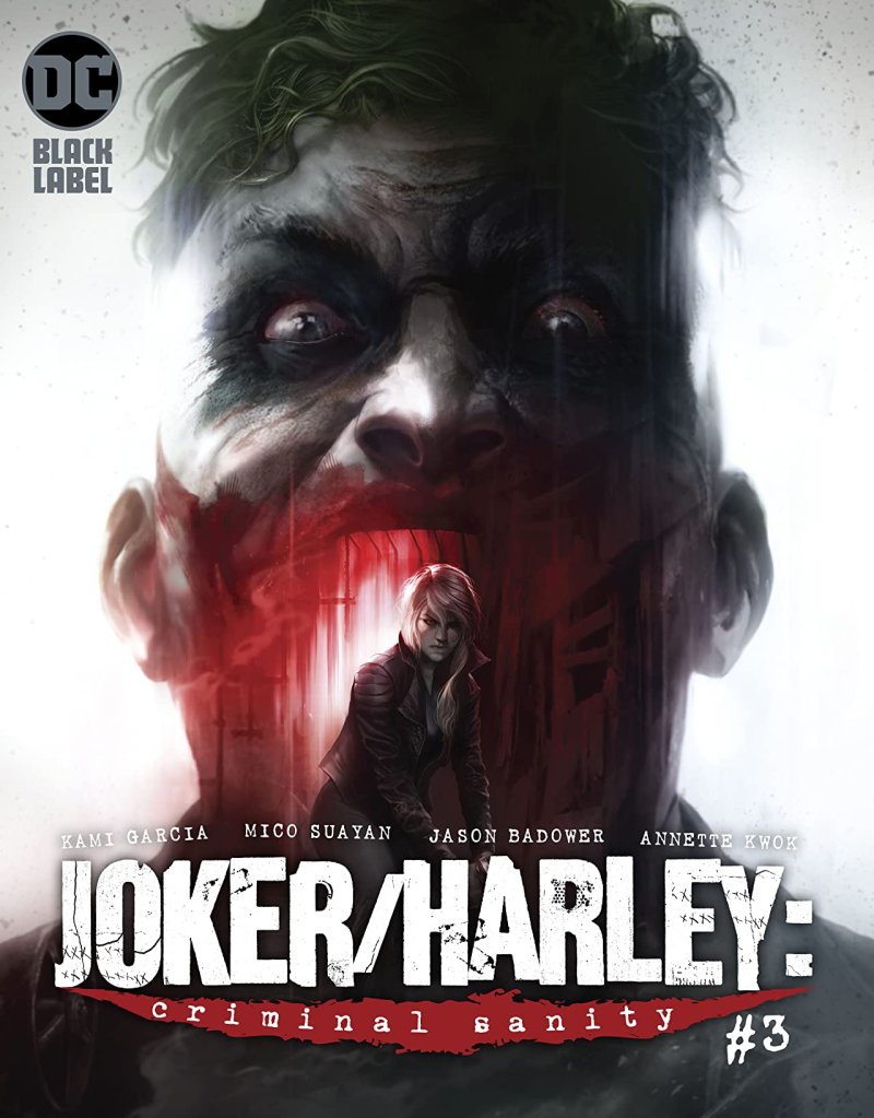
I may as well tell you straight off the bat that this is my favourite issue so far. That said this cover does not really appeal to me. However, I appreciate the way in which the Joker’s open mouth mimics some sort of fairground attraction. It is big and it is bold, and it would not appeal to me on the shelf.
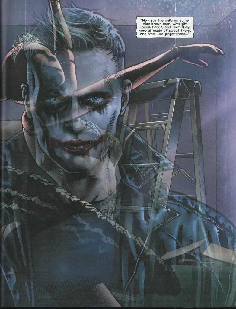
As we learn more about this version of the Joker Garcia is bringing the theme of masks to our attention. Generally, the Joker has one of the most interesting masks because, much like his character, it is always up for interpretation. Sometimes we see Killing Joke Joker with the permeant chemical white face, other times we get a Heath Ledger Joker who uses make-up. I really think that there is a big difference between these two and that difference lies in the intention. The difference lies in the intention. This Criminal Sanity Joker chooses to intentionally paint his face the way he does, as opposed to a chemical-bath Joker who is more of a victim. I believe that the murders already show a strong desire to present a certain identity to the world, and the Joker make up strengths this depiction.
The Joker himself muses on the nature of masks which emphasises his sociopathic tendencies. It’s not only an interesting argument, but it also offers a rare insight into the mind of the Joker. Is this a good thing? For me, the jury is currently out. I do think that the Joker is a fascinating character because he’s a bit on an anomaly. I’ve always loved what Alfred says about in in the Nolan Dark Knight Trilogy, “Some men just want to watch the world burn”. That said I don’t think there’s a right way to write the Joker and given that this is Black Label I’m much more open to see a different iteration of the character.
As I’ve mentioned in previous reviews, we also return to the question of nature versus nurture. As the issues progress it seems as though Garcia is favourite nature over its counterpart, through the comparison of both Harleen and Joker’s childhood experiences.
Though I’m not the biggest fan of the cover the art inside continues to astound me. It is less comic book art, there to deliver a story, but also there to be beautiful and fascinating. The issues in this series are on the shorter side, and I wonder if it’s because the art looks as though it takes so much longer to produce, and rightly so. If we keep getting art like this, then I will take whatever I can get.
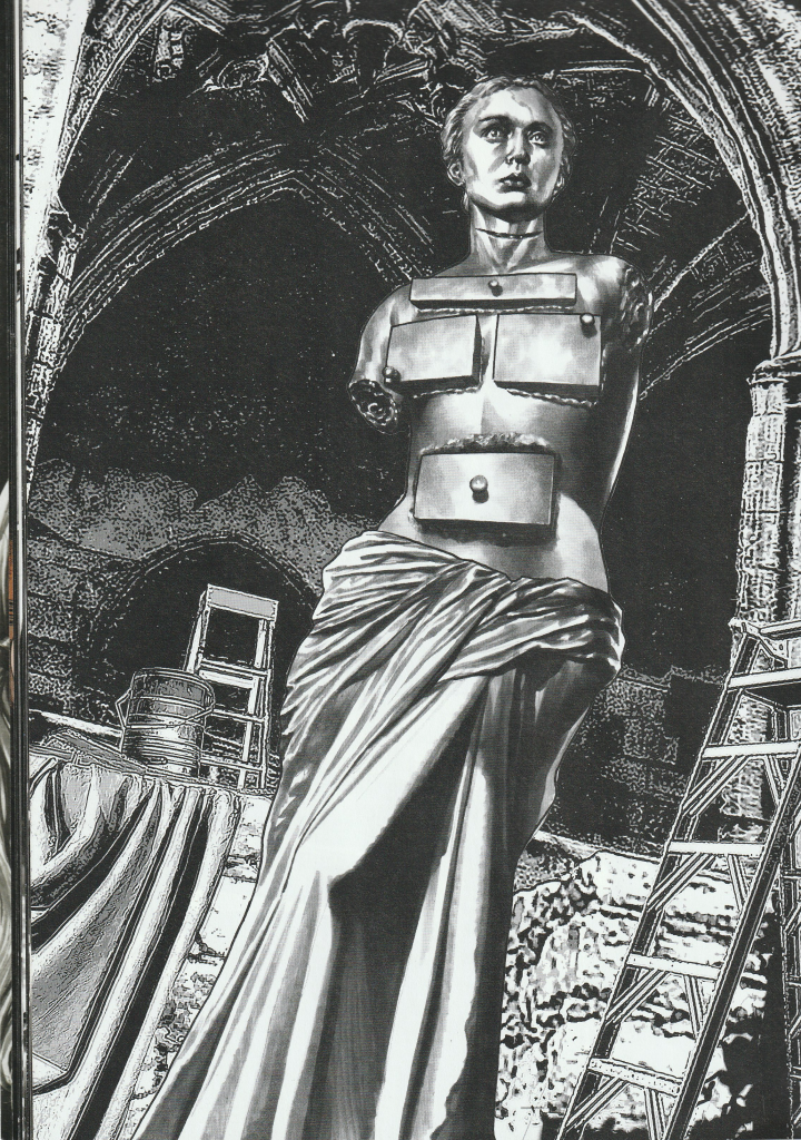
I’m also enjoying the references to famous works of art. I’ve previously mentioned that the murder victims are posed to look like famous works of art. What is also fascinating is the way that this is depicted by the artists. In this image you can see how the corpse mimics Dali, while the background also has its own art style, leaning towards a more illustrative art. I’ve said in the past that I am not an art scholar, and I’m sure someone who is would have a lot more insight than I, but I just wanted to draw your attention to it.
I began this review by claiming this to be my favourite issue so far. However, I am a little concerned about the remaining issues. Where Harleen’s character is at the moment makes a transformation into Harley Quinn impossible, and I think it would take a lot to get her to that point. As a result, it’s not something I am expecting to happen. Also, the story seems to be firmly on this track, and I feel like I can see exactly where it’s going. I really hope there will be an unexpected turn because I want to be surprised rather than simply shocked by gruesome murder scenes. I know what I want, but I am concerned that I will not get it in this series. Still, as always, I hope for the best!
Criminal Sanity #3 is available from Comixology, or you can grab the trade from Forbidden Planet, or your local comic book store.
Coming Soon(ish)… Criminal Sanity #4*
*(Checkout my Housekeeping post for more info)
In the meantime, why not check out… Criminal Sanity #2, Harley Loves Joker, Mad Love by Pat Cadigan, or Mad Love by Paul Dini and Bruce Tim.

[…] Falcon & Winter Soldier #1| Coming Soon- Harley/Joker: Criminal Sanity […]
LikeLike
[…] Criminal Sanity #3|Coming soon- Ruins of Ravenscroft: […]
LikeLike
[…] Criminal Sanity #3|Coming soon- Criminal Sanity […]
LikeLike
[…] Previosuly- Criminal Sanity #1|Coming soon- Criminal Sanity #3 […]
LikeLike